The form of my artist's book will resemble a boxed fast food cheeseburger. The book itself will be 15 inches in height, width, and depth, 3 times as large as the average fast food cheeseburger, a play on 3 square meals a day. The box, or cover, will mimic a McDonald's box in its shape, hinged at the back to enclose its contents and hooked at the front. It will be made of a single sheet of chip board folded at its hinges and collaged with yellow tissue paper. The chip board is a very cheap, low quality material that is readily available and easy to manipulate. The yellow paper will echo the yellow foil used to wrap fast food. Upon opening the cover the reader is presented with a stack of 30 precisely cut 15x15 inch foam-core squares. Each piece of foam-core represents a different layer in this single cheeseburger. Each individual square will be collaged with graph paper on its top and bottom and then crudely hand stenciled with very a simple image of the ingredient (the layer in the cheeseburger- pickles, cheese, ketchup, meet etc.) that it represents. Foam-core was chosen as a material not for its seemingly sturdy appearance, but its actual weightless and empty reality. Like a fast food cheeseburger, there aren't any real quality, ingredients; its all filler. The graph paper is applied in order to represent the mechanized, controlled, ordered system of the food industry in which the cheeseburger is produced. The image is hand stenciled with the lowest artist quality acrylic paint I could find. I chose the most basic, dumbed down colors of red, green, blue and yellow available. My interest is in the dumbing down of the materials or ingredients and in hindering the speed and the ease of which book is read. The "reading" of the book is in the experience of removing each page from the box, consuming its contents and revealing the next layer in the sandwich. This event will not be easy, as each square is large and the box is tight. I want to slow down the viewers consumption. I want to reduce the speed. As the pages continue to be removed the reader will notice the monotony of the images as they are repeated over and over again, slowing the viewers interest. The book is not meant to bore the reader, but rather to make he/she consider their actions, to think about this repetition, and consider the cheap materials used in its production.
Wednesday, March 31, 2010
New Source Statement
Tuesday, March 30, 2010
Roni Horn aka Roni Horn
The ICA is currently exhibiting the most comprehensive survey of works to date of 53 year old American artist, Roni Horn. The show, entitled, "Roni Horn aka Roni Horn," showcases a wide range of Horn's work, including sculptures, drawings, photography and sound installations.
Horn's art explores concepts of identity (her own and subsequently that of the viewer) and how identity changes with environment and develops over time. I thought that her work at first glance, seemed simple and quick but up close I discovered it is full of paradoxes that invite close inspection and comparison. With time, one notes a comparison of materials and environment, of exterior and interior, and of appearance and identity.
Upon entering the main lobby of the ICA, I encountered "Pink Tons," a 5 ton, pink, glass cast sculpture. This giant pink cube rests quietly in the middle of the lobby floor. Its sides are frosted but its top is clear. The light it traps from the natural day light gives view to the air bubbles, cracks and imperfections within, the result of its cooling process. Like many of Horn's sculptures, Pink Tons seems to glow from within, the effect of which changes with the weather conditions. The staying power of the piece for me, was its contradictions. The sculpture is simultaneously heavy and immovable due to its volume and material but also weightless in its translucent, delicate pink hue. It is at once a concrete, solid cube and an ever-changing liquid.
On the wall behind Pink Tons hangs a series of paired portraits of the artist entitled, "a.k.a." Each photograph was taken at a different stage in Horns life. When read from left to right, the first portrait is of a younger Roni, the second of the pair is of an older Roni. Here I was presented with the theme of change very directly, and was immersed in a game of comparing the artist's physical characteristics, her emotions, and how her personality appeared to develop from picture to picture. In exploring her identity, I found myself actually exploring my own. How have I changed? How have I grown up?
Upstairs in the back hallway of the gallery, facing a full expanse of windows overlooking Boston Harbor, are two rooms full of Horn's photos, drawings, and sculptures. In the first room to the left, I was immediately drawn to what I consider my favorite piece in the show, "Paired Gold Mats, For Ross and Felix." Again, a seemingly simple sculpture in form and material however, executed brilliantly and installed perfectly. Two glinting gold mats rest effortlessly on top of one another upon the gallery floor. Between the two gold leaf sheets the natural light from the hallway windows is captured, harnessed, concentrated, mirrored, and multiplied to produce a warm, brilliant orange glow like burning embers. The precious gold material, is rare and malleable. The surface of the mats ripples like the ocean and changes with the light as the viewer moves around the room. The piece is dedicated to Horn's friends, artist Felix Gonzalez-Torres and his partner Ross Laycock, both of whom died of AIDS. Gold Mats successfully reflects the relationship of two lovers, of companionship, of a pair, of the energy produced by the coupling of two lives being greater than that of those when alone. I stayed with this piece for a while. I had a phenomenological experience, my eyes transfixed on the lively hum of orange spilling out from between the gold. I wanted to touch it. Im sure if I had just held my hand inches above the sculpture I could feel warmth emanating from it.
In the same room, back behind Gold Mats, sits "Ant Farm." The sculpture is literally a very large ant farm and is very appropriate for the show. Again the viewer is presented with an ever-changing world sealed between two elements. Between two sheets of glass, a colony of ants builds their city out of earth. This voyeuristic piece changes with each moment, wether viewed from front or back. Like our own world, it is constantly in a state of flux.
In the neighboring room I found "Opposite of White V.2." It is a glass cast sculpture, in the shape of a disk, rising about 2 feet off of the gallery floor. Again, its sides are frosted, resisting light. But this time its surface is dark and ominous like tar. However, when viewed from an angle, the surface is translucent, and one can see its surface is delicately rippled like the surface of the ocean nearby. The black glass sucks in light and drew me in for further inquiry. I really enjoyed this sculpture and found its subtleties very rewarding.
Roni Horn aka Roni Horn, explores the theme of identity through many different materials and practices. At first glance Horn's art can be read as basic glass sculptures or average portraits. But with time and consideration, often times a change in position or time of day, one will find a wealth of subtleties and contradictions, of visual pleasure and insight and hopefully a better understanding of ones own identity.
Essay Response - What Time Looks Like at the Moment: Artists Sequencing Books
Mark's essay, "What Time Looks Like at the Moment: Artists Sequencing Books," gives a broad overview of what an artist's book is, or can be. The essay presents the many different forms an artist's book can take, from the materials used, to the content of its "pages", to the way the book is bound (or not), to the way in which the reader interacts with its content. Mark partners each book type with an example of an actual artist's book. I particularly enjoyed the ideas of Michael Snow, Edward Ruscha, John Baldessari, Sigmar Polke, and Dieter Roth. I liked the way in which they investigate what sequence means. Snow plays with space and presents the reader with the option of reading the book from the front cover or from the back cover, rendering the use of "front" and "back" meaningless. Ruscha's, "Every Building on the Sunset Strip," also comments on space (location) and gives an actual account of every building on the Sunset Strip. His images locate buildings sequentially along the road so that as the reader travels through the book, he/she travels down the road through L.A. Baldessari's, "Brutus Killed Caesar," uses syntax in a very direct, often humorous way. His images read from left to right like a sentence. Sigmar Polke's, "Daphne," uses photocopying to comment on the ideas of mechanization and standardized processes. By pulling the photocopies as they print he creates smears which denote the artist's hand, manipulation, chance, and a sense of play. It is about the battle between accident and system. Dieter Roth's, "Daily Mirror," is less about the sequence of information than an amount of information. "Sequencing becomes an act of amplification." There is no real beginning, middle, and end. Roth leaves ordering in the readers' hands. This allows for meandering and random encounters. This is what stuck with me the most from the reading, in terms of my own work. A specific sequence is not always the most important thing, sometimes it is about a cumulative effect of so much material. Time can be expressed in the repetition of controlled ingredients, in the build up of stuff. In book form, that build up of "stuff" can be physical pages. The idea develops and is transmitted as the reader physically stacks pages.
Wednesday, March 17, 2010
Source Update (Book)
For my artists' book, I will explore the process of mass production. My book will express the construction of a cheeseburger. Each page will depict a single ingredient (or layer) of the sandwich. Like an assembly line, the reader will turn each page and be presented with the next layer or step in the process of building the cheeseburger. The first page will be an image of the top bun, the second page, an image of pickles, the third page, an image of bacon. Then cheese, and a succession of hamburger patties (etc.). More pages, more ingredients. The images will be printed on graph paper (or perhaps foam-board)- the grid used as a symbol of control, order, routine and predictability. The book itself will be very large, about 3'x3'. I want it to be too big for a book shelf and too big for a coffee table. The size of the book will require two hands to read and hopefully slow the process of reading its contents.
Thursday, March 4, 2010
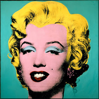
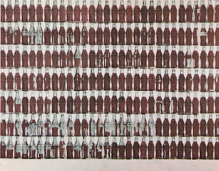
Biography: Andy Warhol


Andy Warhol was born on August 6th, 1928 (died February 22nd, 1987), in Pittsburgh, Pennsylvania. He studied commercial art at the School of Fine Arts at Carnegie Institute of Technology in Pittsburg. In 1949, Warhol moved to New York to work in magazine illustration and advertising. He eventually took a job with RCA records designing album covers and promotional materials. Warhol's first one-man show was at the Ferris Gallery in Los Angeles in 1962. There, he showed the now famous 32 Campbell's Soup Cans. That same year he exhibited at Stable Gallery in New York, where he showed 100 Coke Bottles, 100 Dollar Bills, 100 Soup Cans, and the Marylin Diptych. Perhaps the most famous artist of the Pop movement, Warhol was a fim maker, print maker, and painter who's work questioned American consumerism, death, celebrity, mass advertising and reproduction among other themes.
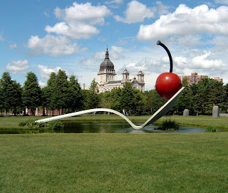
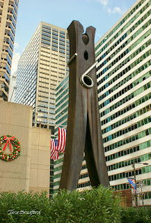
Biography: Claes Oldenburg


Claes Oldenburg was born on January 28th, 1929 in Stockholm Sweden. He and his family moved to the US in 1936, first to New York and then to Chicago where he grew up. He studied at Yale from 1946-1950 and then at the Art Institute of Chicago until 1954. In 1956, Oldenburg moved to New York where he befriended Jim Dines, Red Grooms, and Allen Kaprow. Kaprow's "Happenings" inspired Oldenburg to look at everyday objects in a new light. Oldenburg is interested in the physical objects of mass culture and also monuments. In 1961, he rented an actual store on 2nd St., on New York's Lower East Side, and filled it with oversized objects made of paper mache, canvas and resin. He made shirts and socks, a sewing machine, a huge cheeseburger, and slices of pie. He chose objects with a specific architecture - things that were made up of basic geometric structures. Oldenburg changed the scale and the materials of these objects. Soft things were made of hard materials and hard things he made soft and flacid. In these objects, Oldenburg saw metaphors for the human form.
Subscribe to:
Posts (Atom)


